Nintex – Brand-Aligned Marketing Design, Motion & UX
Designing clarity for complex enterprise solutions.
As a core member of Nintex’s creative marketing team, I led the visual rebranding of their white papers and eBooks, transforming dense technical content into clean, engaging, on-brand assets. I also produced a wide range of supporting design materials — from motion graphics and video edits to digital ads and campaign visuals — helping Nintex communicate its workflow automation tools with clarity and polish.
My Role
Lead designer for white paper and eBook rebranding initiative
Motion graphics animator and video editor for global campaigns
Graphic designer for digital and print marketing collateral
Visual QA and consistency across brand deliverables
Problem
Nintex’s marketing collateral lacked visual consistency and modern appeal, with outdated layouts and fragmented branding across white papers, eBooks, and campaign assets. Their motion and video content also needed clearer storytelling and a more cohesive visual style to better communicate product value and support sales efforts.
Project Scope
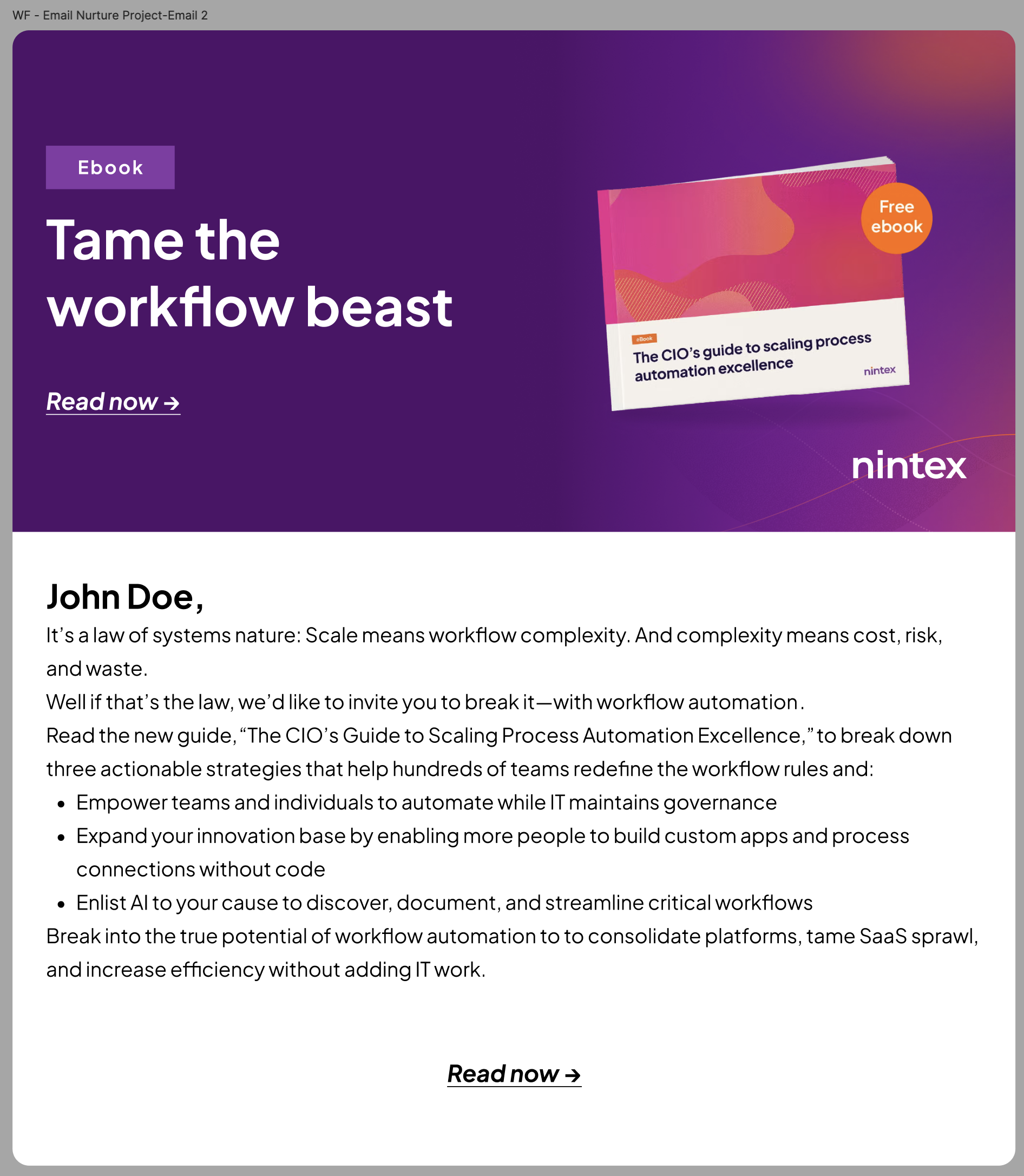
Help rebrand the full suite of white papers, eBooks, and technical PDFs
Created motion graphics for promotional and product marketing videos
Edited customer testimonial videos and webinar content
Designed digital assets for campaigns, events, and paid media
Collaborated with marketing leads, content writers, and stakeholders
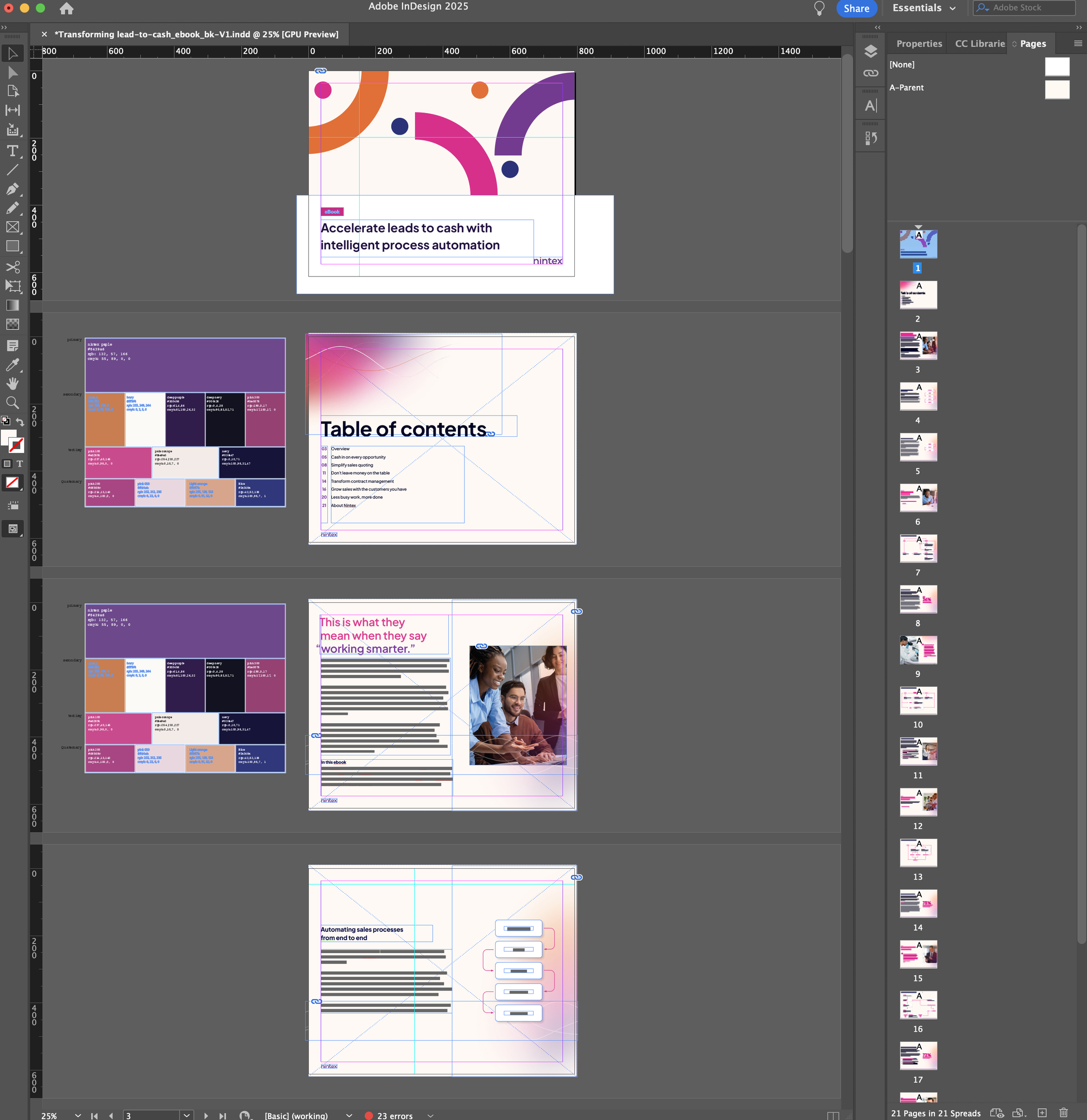
Old Designs
The original white papers and eBooks relied on outdated templates with cluttered layouts, inconsistent typography, and minimal visual hierarchy. They lacked brand cohesion and often felt dense or difficult to navigate — making it harder for readers to engage with the content. As Nintex’s platform evolved, their marketing materials needed a more modern, polished look that better reflected the company’s innovation and enterprise credibility.
a New Visual Consistency
I worked closely with Nintex’s creative director to align on visual direction, iterate on design systems, and ensure every asset met brand and business goals. Our process involved regular check-ins, collaborative feedback sessions, and rapid prototyping to refine layouts, motion pieces, and templates — all while maintaining consistency across a wide range of deliverables.
The Payoff
The refreshed designs became the new standard across Nintex’s global marketing efforts, improving brand consistency and elevating the professionalism of all external-facing materials. The redesigned white papers and eBooks were easier to read and more visually engaging, while the motion and video assets helped boost campaign performance and audience retention. I also designed hundreds of marketing emails sent to clients worldwide — reinforcing the new visual identity and playing a key role in promoting the updated brand.
Motion Graphic Examples
Lower Thirds Animation Example
Evolve Event Bumpers/Transitions
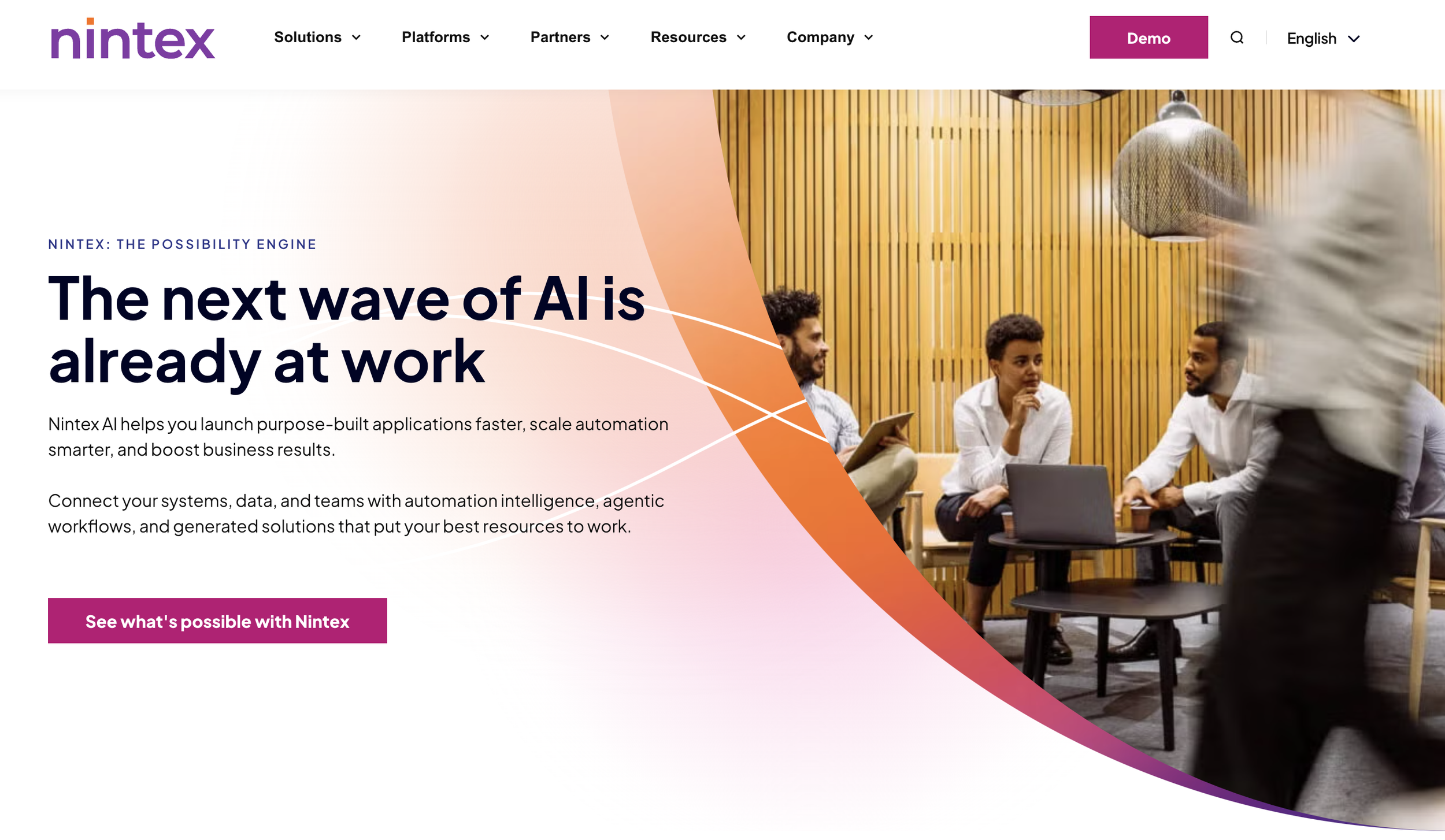
Rebranded Website
While I wasn’t directly involved in the UX or structural design of the Nintex website, many of the assets I created — from rebranded graphics to motion pieces and marketing visuals — were integrated across the site as part of the broader brand refresh. You can see the updated brand in action here: