The Giving Pledge Website and Brand Refresh
Agency: Catalysis
My Role: UI Design | UX Design | Wireframes | Production Design | Prototyping
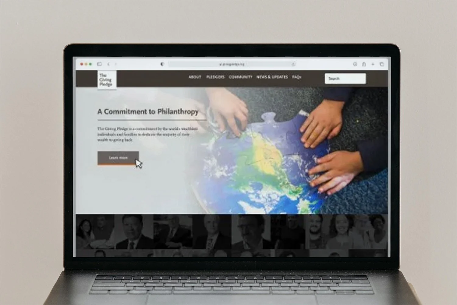
The Giving Pledge is a global philanthropic initiative that invites the world’s wealthiest individuals and families to commit the majority of their wealth to charitable causes—either during their lifetimes or in their wills. Inspired by generosity at all income levels, the initiative promotes large-scale giving to improve the world.
I was brought in as part of the Catalysis design team to help modernize the Giving Pledge website — refreshing the brand, improving usability, and ensuring accessibility across devices.
Problem:
The existing website was outdated, both visually and functionally. Designed for smaller screens, it lacked responsiveness and relied on a mobile-style hamburger menu for all navigation — even on desktop. The result was a disorienting user experience and limited engagement. Additionally, the color palette presented contrast issues, raising accessibility concerns.
The client needed a modern, more vibrant interface that remained respectful of the brand’s tone, while also being more intuitive and accessible for a wide range of users.
Deliverables:
Refreshed Visual Brand System
Revised User Flow and Navigation
Wireframes and Low-Fidelity Concepts
Interactive Prototype
Final Production-Ready UI
Old Design:
The previous design was intended for smaller displays, and also made use of a menu system that was not suited for desktop use. The overall look and feel of the website was dated.
Design Approach
Improved Contrast & Accessibility
Accessibility testing on the original site revealed insufficient contrast ratios in key UI elements. I introduced a revised color palette with greater contrast and visual clarity, striking a balance between elegance and accessibility.
Simplified Navigation & User Flow
The legacy site hid nearly all navigation behind a hamburger menu, making it hard for users to orient themselves or explore the site. I redesigned the user flow and implemented a more intuitive, visible navigation structure — enabling clearer paths to key content and better usability across breakpoints.
Modernized Layouts & Responsive Design
I reimagined the site layout to better suit modern displays and devices. The updated grid, typography, and spacing created a more inviting and readable experience while staying true to the Giving Pledge’s minimalist ethos.
Wireframes
While the core content of The Giving Pledge website was straightforward, the previous layout made navigation feel unintuitive and disjointed. Through a streamlined set of wireframes, I restructured the site’s layout and simplified the navigation flow — allowing the initiative’s message to take center stage and improving clarity for users across all devices.
Refreshed Brand
Accessibility testing revealed several issues with the original color and contrast ratios, opening the door for a refreshed visual approach. I introduced a more modern, accessible palette along with updated text styles that improved legibility while subtly evolving the brand’s tone.
While not all of the proposed color directions made it into the final build, the client responded positively and expressed interest in adopting these updates in future iterations of the brand.
Prototyping & Build
Alongside the final designs, I delivered functional prototypes to demonstrate how the streamlined navigation and layout would perform in a real-world context. These interactive prototypes allowed the client to explore the user experience firsthand across both desktop and mobile — ensuring the design system felt cohesive, intuitive, and responsive on all devices.
Final Design
“YES! Color!”